The confirmation window appears to much
The confirmation window that appears on the bottom left of the screen when for example deleting a task appears to much in my opinion (and I would keep it out completely)
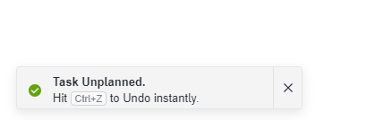
The confirmation window that appears on the bottom left of the screen when for example deleting a task appears to much in my opinion (and I would keep it out completely)
Log in to comment and vote
No comments yet
Be the first to share your thoughts.